Introduction: Waterproof painting is a critical solution to safeguard various surfaces from the damaging effects of moisture. From bathrooms and basements to exterior walls and roofs, this specialized paint, equipped with advanced nano-technology, acts as a robust defense against water intrusion. In this guide, we’ll explore the nuances of waterproof painting, offering insights into techniques and tips derived from our experienced team at Paint Sutra.
Table of Contents:
- Understanding Waterproof Paint: Delve into the definition of waterproof paint and its specialized characteristics designed to combat water infiltration, making it an ideal solution for areas susceptible to dampness and constant exposure to water.

- 9 Tips and Techniques for Effective Waterproof Painting:
- Choose the Right Paint: Explore the importance of selecting waterproof or water-resistant paint tailored for specific surfaces, with recommendations for acrylic and elastomeric paints for exterior use.
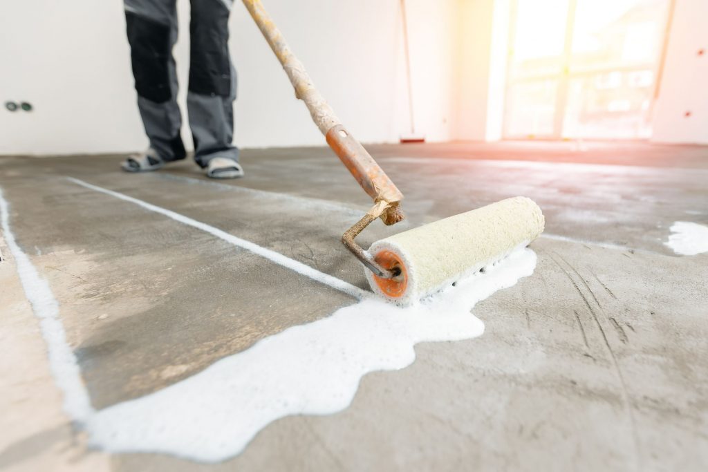
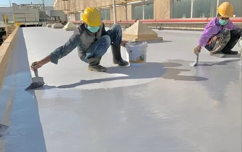
- Surface Preparation: Highlight the significance of thorough surface preparation, including cleaning, removal of old paint, and repairing cracks to ensure a smooth and even canvas for painting.

- . Application of Primer: Emphasize the use of high-quality waterproof primer to enhance adhesion and create a protective barrier between the surface and the paint.
- Waterproof Caulk for Sealing: Discuss the role of waterproof caulk in sealing gaps around windows, doors, and joints, preventing water infiltration and ensuring a secure seal.
- Elastomeric Paint for Flexibility: Explore the benefits of elastomeric paint, known for its ability to stretch and contract, accommodating house movements and preventing water penetration—ideal for areas prone to cracks.
- Utilizing Waterproofing Additives: Discuss the addition of waterproofing additives to enhance paint durability, creating a fortified barrier that increases resistance to water damage.g.
- Textured Finishes for Protection: Highlight the protective qualities of textured finishes, such as stucco or textured paint, which create a layer with natural water-shedding properties to prevent water buildup.
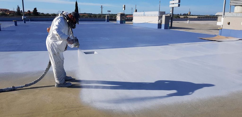
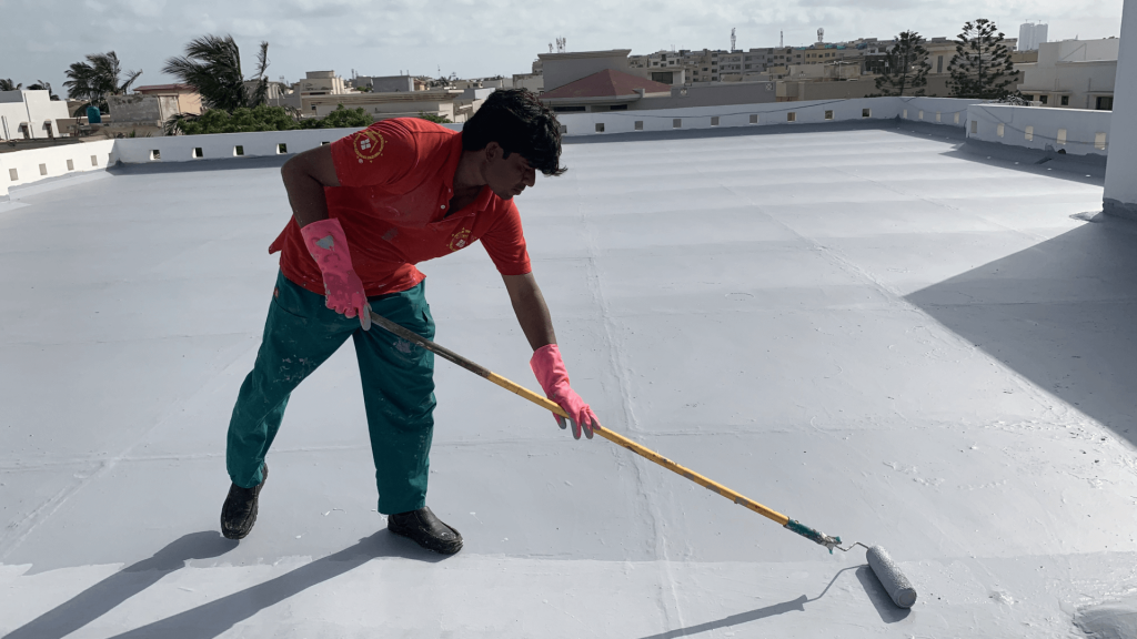
- Multiple Coats Application: Stress the importance of applying at least two coats of waterproof paint, ensuring each coat dries thoroughly before the next application for maximum effectiveness.i. Professional Assistance: Acknowledge the complexity of certain projects and recommend seeking professional help for a high-quality, waterproof finish. Discuss the expertise and tools a professional waterproof painter brings to the table.
- Essential Areas for Waterproof Painting: Explore specific areas where waterproof painting is essential, including internal walls, external walls, roofs, bathrooms, and basements. Discuss how waterproof painting in these areas contributes to maintaining a dry, healthy, and structurally sound environment.
- Conclusion: Reinforce the importance of waterproof painting as an investment in a home’s longevity, protecting it from water-related damage and preserving its beauty and resilience against harsh elements. Encourage proactive measures and prompt action to fortify homes against potential water-related woes.
- Call to Action: Invite readers to contact professional services for a free quote, emphasizing the importance of taking steps now to protect their home investments from water damage.