Tag: #WallPainting

Berger Paints Q1 Profit Drops 11% – What Went Wrong?Berger Paints Q1 Profit Drops 11% – What Went Wrong?

🔴 Key Highlights from Berger Paints’ Q1 FY25-26 Results

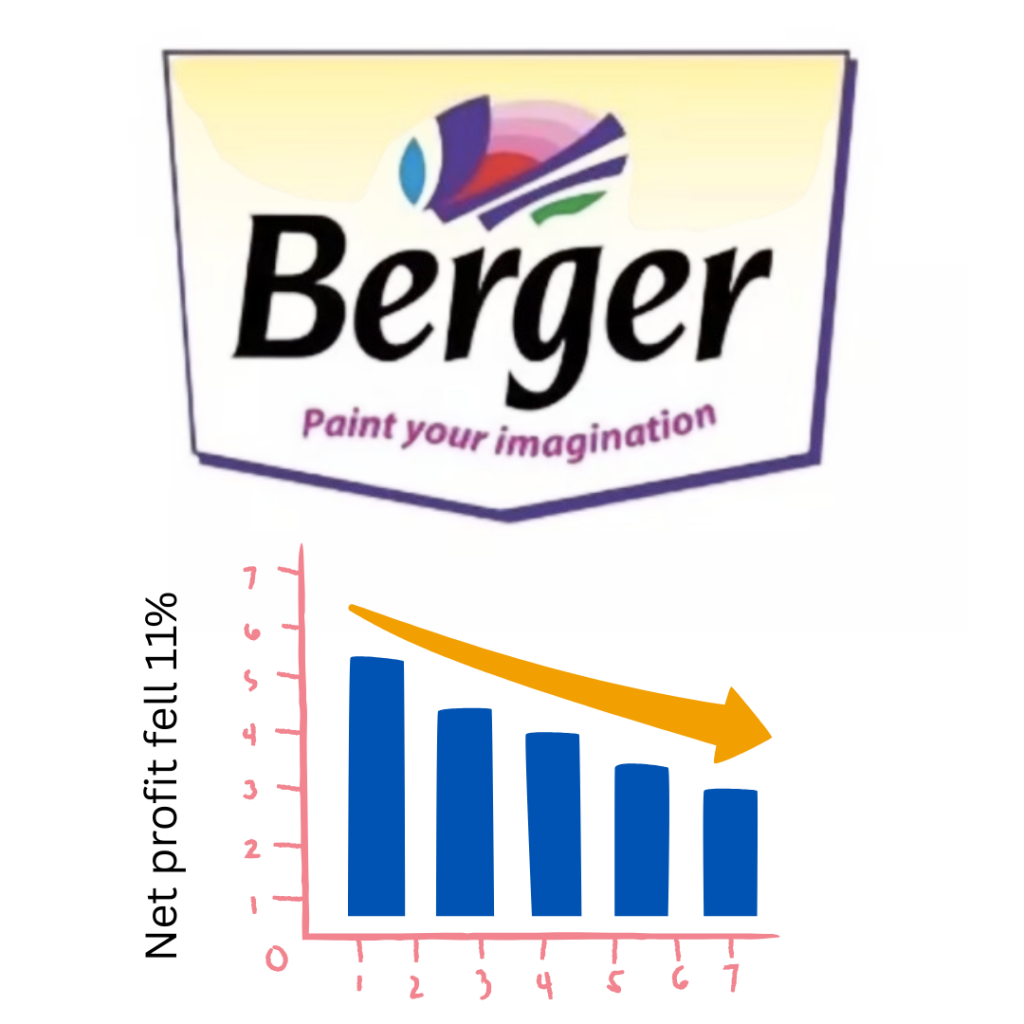
📉 Profit Decline: Net profit fell 11% YoY to ₹315 crore (vs. ₹354 crore in Q1 FY24-25).
💰 Revenue Growth: Revenue rose 3.5% YoY to ₹3,200.76 crore (vs. ₹3,091.01 crore).
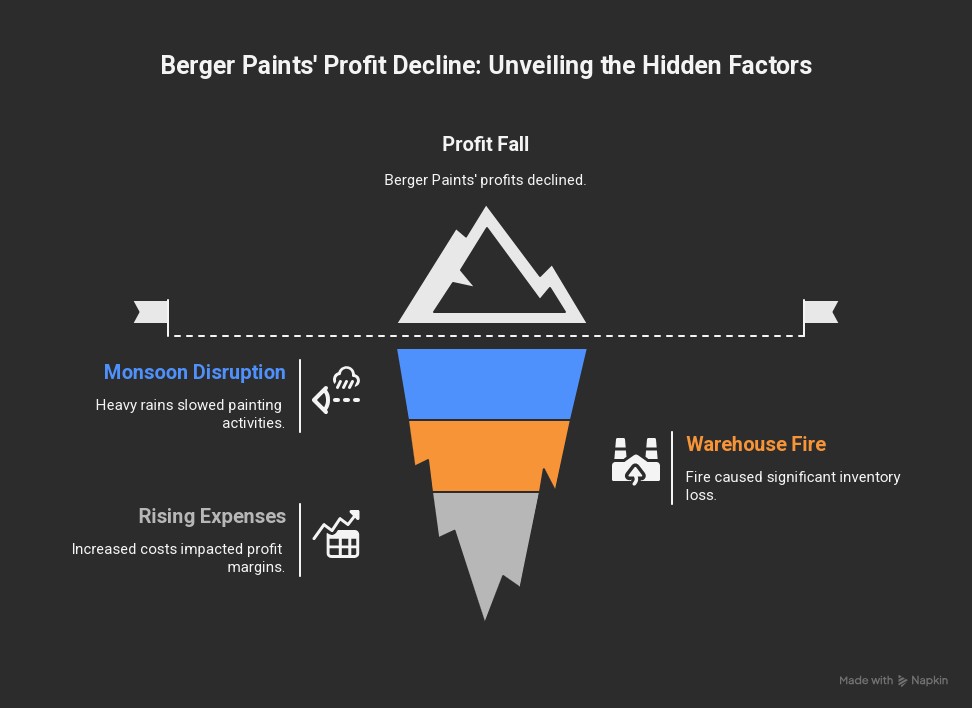
🌧️ Monsoon Impact: Early & heavy rains in May-June hurt sales volume growth.
🔥 Fire Incident: An exceptional loss of ₹36.81 crore due to a fire at Kolkata warehouse.
📈 Market Share Gains: Despite challenges, Berger improved its market share.


📉 Why Did Berger Paints’ Profits Fall?

1. Monsoon Played Spoilsport

  • Unusually heavy rains in May-June slowed down construction and painting activities.
  • CEO Abhijit Roy confirmed that demand was weaker due to weather disruptions.

2. Fire at Kolkata Warehouse

  • A fire at a Barasat distribution centre caused ₹36.81 crore loss.
  • The blaze spread from a neighboring company’s facility, damaging Berger’s inventory.
  • Insurance claims are under process, but the loss impacted quarterly profits.

3. Rising Costs

  • Total expenses increased 4.11% YoY to ₹2,780.81 crore.
  • Raw material costs and operational expenses weighed on margins.

🚀 Silver Lining: Berger Still Gained Market Share!

Despite the profit drop, Berger Paints:
✔ Outperformed industry players in value growth.
✔ Reduced volume-value gap to 3.6% (vs. 7% last fiscal).
✔ Maintained strong brand presence in a competitive market.


📊 Stock Market Reaction


🔮 What’s Next for Berger Paints?

  • Monsoon impact is temporary – demand likely to rebound in H2 FY25-26.
  • Insurance claim recovery could boost future profits.
  • New product launches and expansion plans may drive growth.

💬 Your Thoughts?

Do you think Berger Paints will bounce back strongly in Q2? Drop your views in the comments!

Paint Sutra – Your Complete Home Painting Solution

Contact: ☎️ 9700226666 | 8336885588


READ MOREREAD MORE

DIY Wall Painting Made Easy: Step By Step Guide For A Stunning Home MakeoverDIY Wall Painting Made Easy: Step By Step Guide For A Stunning Home Makeover

Transforming your home with a fresh coat of paint is one of the easiest and most cost-effective ways to breathe new life into your space. Whether you’re looking to refresh a dull room or experiment with bold colors, DIY wall painting can be a fun and rewarding project. Follow this step-by-step guide to achieve a professional-looking finish without the hefty price tag.


Step 1: Plan Your Design & Choose the Right Paint

Before diving in, decide on the color scheme and finish you want. Consider factors like:

  • Room lighting (natural vs. artificial)
  • Wall texture (matte, satin, or glossy finish)
  • Mood (calming neutrals, vibrant accents, or trendy patterns)

Pro Tip: Use online color visualizers or sample swatches to test shades before committing.


Step 2: Gather Your Supplies

Here’s what you’ll need:

  • Paint (primer + topcoat)
  • Paint rollers, brushes, and trays
  • Painter’s tape (for clean edges)
  • Drop cloths (to protect floors and furniture)
  • Sandpaper & spackle (for wall repairs)
  • Stir sticks & a paint can opener

Step 3: Prep the Room & Walls

Proper preparation ensures a smooth finish:

  1. Clear the space – Move furniture or cover it with plastic sheets.
  2. Clean the walls – Remove dust, grease, or cobwebs with a damp cloth.
  3. Repair imperfections – Fill holes with spackle, sand smooth, and wipe away dust.
  4. Tape edges – Apply painter’s tape to trim, ceilings, and outlets for crisp lines.

Step 4: Prime the Walls (If Needed)

Primer helps paint adhere better, especially on:

  • New drywall
  • Dark-colored walls being painted lighter
  • Stained or uneven surfaces

Skip this step if using a paint + primer combo.


Step 5: Start Painting!

Follow these techniques for a flawless finish:

  1. Cut in first – Use an angled brush to paint edges and corners.
  2. Roll in sections – Work in 3×3 ft areas with a “W” motion for even coverage.
  3. Maintain a wet edge – Avoid lap marks by blending freshly painted areas quickly.
  4. Apply a second coat – Wait 2-4 hours between coats for best results.

Step 6: Add Creative Touches (Optional)

Elevate your walls with:

  • Geometric patterns (using tape for sharp lines)
  • Ombre or sponge effects (for texture)
  • Stencils or murals (for artistic flair)

Step 7: Clean Up & Reveal Your Masterpiece Once dry:


✔ Remove painter’s tape at a 45-degree angle.
✔ Touch up any missed spots.
✔ Clean brushes and rollers for reuse.

Transform Your Home with Vastu-Approved Colors!

Want a home that’s not just beautiful but also brings peace, positivity, and prosperity? Follow these Vastu color tips for a harmonious space:

✔ Ceilings → Always white or light-colored to keep the energy light & expansive.
✔ Doors & Windows → Wooden shades or white attract positivity & good vibes.
✔ Children’s Room → Soft green or blue boosts creativity & calmness for better focus.

Choosing the right shades as per Vastu can enhance your home’s energy. Let Paint Sutra’s Colour Specialists guide you!

📞 Call Now: 9700226666 | 8336885588
🌐 Visit: www.paintsutra.com

READ MOREREAD MORE

Brush vs. Roller vs. Spray: Which Painting Method is Best?Brush vs. Roller vs. Spray: Which Painting Method is Best?

Choosing the right painting tool can mean the difference between a flawless finish and a DIY disaster. Whether you’re refreshing a room, tackling furniture, or painting your entire house, the battle between brushes, rollers, and spray guns is real.

But which one wins? Let’s find out!


1. Brush Painting: The Classic Choice

Why You’ll Love It:

  • Surgical precision for edges, trim, and tight corners
  • No masking needed—just steady hands and patience
  • Best for detail work like cabinets, doors, and molding

Where It Falls Short:

  • Slow and tedious for large walls
  • Brush strokes can ruin a smooth finish if you’re not careful
  • Not ideal for big, flat surfaces

Perfect For: ✔ Cutting in around ceilings and baseboards
✔ Staining wood or painting intricate furniture
✔ Small touch-ups and artistic finishes


2. Roller Painting: The Speed Demon

Why It’s a Fan Favorite:

  • Covers walls in minutes—way faster than a brush
  • Smooth, even coats (if you use the right nap)
  • Minimal mess compared to sprayers

The Downsides:

  • Still needs a brush for edges (cutting in)
  • Can leave lint or texture if you cheap out on the roller
  • Uses more paint than spraying

Perfect For:

✔ Painting entire walls and ceilings
✔ DIYers who want speed without the sprayer learning curve
✔ Budget-friendly projects


3. Spray Painting: The Pro-Level Powerhouse

Why Pros Swear By It:

  • Blazing fast—cover a whole room in record time
  • Flawless, streak-free finish (when done right)
  • Great for tricky surfaces like cabinets, fences, and textured walls

The Catch:

  • Major prep work (masking, drop cloths, ventilation)
  • Overspray gets everywhere if you’re not careful
  • Expensive upfront cost (and a learning curve)

Perfect For:

✔ Large projects (exteriors, whole-house painting)
✔ Refinishing cabinets or furniture
✔ Anyone who values speed over simplicity


The Final Verdict: Which One Should YOU Use?

Tool Best For Worst For Skill Level
Brush Details & edges Big walls Beginner
Roller Fast wall coverage Precision work Intermediate
Sprayer Large, smooth jobs Small, messy spaces Advanced

Quick Decision Guide:

  • “I just need to paint my walls.” → Roller + Brush for edges
  • “I’m redoing my kitchen cabinets.” → Sprayer (or brush for small jobs)
  • “I want perfection on trim and doors.” → High-quality brush

Paint Sutra: Colour Wisdom for Your Home

Elevate your space with these Vastu-inspired colour tips:

  • Ceilings: Always use white or light colours to create an open, airy feel
  • Doors & Windows: Opt for wooden tones or white to attract positivity
  • Children’s Room: Light green or blue enhances creativity and calmness
  • Kitchen: Warm yellows or oranges promote nourishment and happiness

Need expert colour advice?
Consult our Paint Sutra specialists today!
📞 Call: 9700226666 | 8336885588
🌐 Visit: www.paintsutra.com


READ MOREREAD MORE

Vastu Colours for Home Kitchen and Wall-A Complete Guide with Colour ChartVastu Colours for Home Kitchen and Wall-A Complete Guide with Colour Chart

Choosing the right colours for your home is not just about aesthetics; it also plays a significant role in creating positive energy and harmony according to Vastu Shastra. The ancient Indian science of architecture suggests that colours influence mood, health, and prosperity.

In this blog, we’ll explore the best Vastu colours for home, kitchen, and walls, along with a Vastu colour chart to help you make the right choice.


Why Are Vastu Colours Important?

According to Vastu, every colour has a unique vibration that affects the energy flow in a space. The right colours can:

  • Enhance positivity
  • Improve mental peace
  • Boost prosperity and relationships
  • Balance the five elements (Earth, Water, Fire, Air, Space)

Best Vastu Colours for Different Rooms

1. Living Room (North or Northeast Wall)

The living room is where family and guests gather, so it should have welcoming and vibrant energy.

  • Best Colours: Light shades of yellow, green, blue, or white
  • Avoid: Dark red or black (can create aggression or negativity)

2. Bedroom (Southwest Direction)

The bedroom should promote relaxation and harmony between couples.

  • Best Colours: Light pink, peach, light blue, lavender, or cream
  • Avoid: Bright red (can cause restlessness) or dark grey

3. Kitchen (Southeast Direction – Fire Element)

The kitchen represents fire energy, so warm and bright colours work best.

  • Best Colours: Orange, red, yellow, or rose pink
  • Avoid: Black or dark blue (suppresses fire energy)

4. Study Room / Home Office (North or East Direction)

Enhance concentration and mental clarity with soothing yet energizing colours.

  • Best Colours: Light green, sky blue, or white
  • Avoid: Dark brown or grey (can cause lethargy)

5. Bathroom (Northwest Direction)

Bathrooms should feel clean and fresh.

  • Best Colours: White, light grey, or pastel shades
  • Avoid: Dark colours (can make the space feel heavy)

Vastu Colour Chart for Home

Direction Recommended Colours Avoid Colours
North Light Blue, Green Dark Red, Black
Northeast White, Light Yellow Dark Brown
East Green, Light Blue Dark Grey
Southeast Orange, Red Black
South Red, Pink Blue
Southwest Peach, Earthy Tones Bright Red
West White, Light Grey Dark Blue
Northwest White, Light Grey Dark Red

Additional Vastu Colour Tips

  • Ceilings: Should always be white or light-coloured to create an open and airy feel.
  • Doors & Windows: Use wooden shades or white for positivity.
  • Children’s Room: Light green or blue enhances creativity and calmness.
  • Expert guidance – Consult our colour specialists call Paint Sutra:- 9700226666, 8336885588

Why Choose Paintsutra for Vastu-Compliant Painting?

✅ Eco-friendly paints – Safe for families and the environment.
✅ Wide Vastu range – Curated shades for every direction.
✅ Expert guidance – Consult our colour specialists for a Vastu-aligned home.


Conclusion

Choosing the right Vastu colours for your home can significantly impact the energy, mood, and prosperity of your living space. By following this Vastu colour guide, you can create a balanced and harmonious environment.

Would you like a personalized Vastu colour consultation for your home? Let us know in the comments!

READ MOREREAD MORE