- Local Recommendations: Ask friends, family, or neighbors for recommendations. Personal experiences can provide valuable insights into the quality of service.
- Online Reviews: Check online review platforms such as Google, Yelp, or local business directories to read reviews from previous customers.
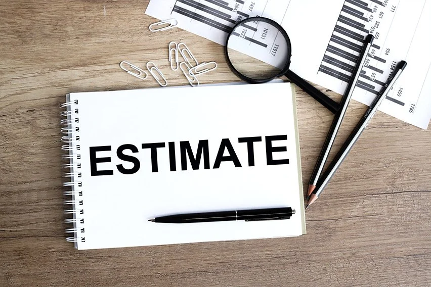
- Multiple Quotes: Obtain quotes from multiple painting contractors. This will help you compare prices and services to ensure you’re getting a competitive rate.
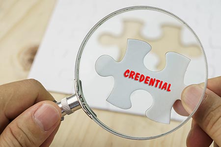
- Check Credentials: Ensure that the painting service provider is licensed, insured, and has a good track record. This helps guarantee the quality of their work and protects you in case of any issues.
- Portfolio: Review the contractor’s portfolio to assess the quality of their previous work. Many professionals showcase their projects on their websites or social media pages.
- Ask for References: Request references from the painting contractor and contact their past clients to inquire about their experiences.
- Clear Communication: Choose a contractor who communicates effectively and is willing to answer any questions you may have. Clear communication is crucial for a successful project.
- Check for Discounts or Promotions: Some painting services offer promotions or discounts during specific times of the year. Keep an eye out for such opportunities.
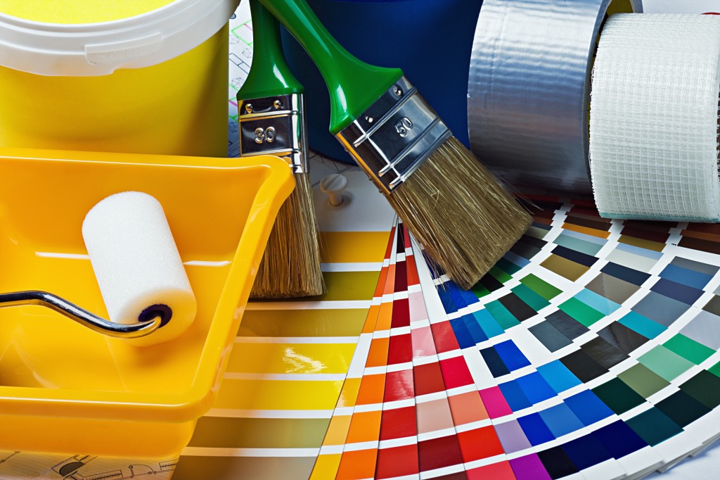
Remember that the cheapest option may not always provide the best quality. It’s essential to strike a balance between affordability and quality to ensure a satisfactory outcome. Always make sure to discuss the details of the project, including the type of paint, the number of coats, and any additional services, to get an accurate quote.